


Introduction
When a visitor completes a contact form on a phone and taps Send, the process can appear finished. A good form should clearly explain what happened and deliver the enquiry to the right person. Assessing a mobile contact form requires testing the short journey from submission to internal follow-up, beyond whether the button works.
Did the submission really finish?
First check how the form handles empty or invalid fields. A missing required field should produce a message beside that field, and users should be able to correct it without losing their entries. One tap should be enough when valid information is submitted. On a slow connection, an in-progress status helps prevent repeated taps and duplicate enquiries.
Repeat the test on a real phone and, if possible, another browser. The on-screen keyboard, zoom and narrow layout can change submission behaviour, so include them alongside desktop previews.
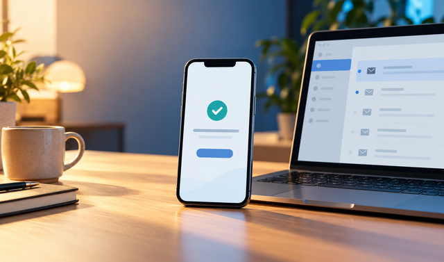
Does the visitor see a clear response?
After a successful submission, show a short, clear message such as ‘Your message has been received’. If it promises a response time, make sure the business can meet it. If submission fails, explain what the user can do to try again. Keep the error visible long enough to read.
The next step should also be clear on the success screen. The visitor may return to the page, choose another contact channel or view an enquiry summary if needed. Resolving uncertainty is more helpful here than adding a new sales claim.
Does the enquiry reach the right place?
A success message alone does not prove that the team received the enquiry. Submit a test form and check the business’s inbox, dashboard or enquiry system. Are the message, contact details and submission time correct? If notifications go to different people, verify which service request reaches whom.
Use a clearly marked test record to keep it separate from genuine customer enquiries. Check how the team marks it after testing so that receipt and handling remain two clear stages.
Which mobile details can cause problems?
Fields should be easy to select by touch, labels should remain understandable outside the fields and the submit button should be easy to see. Phone fields should open a numeric keyboard where appropriate, and email fields should help identify typing errors. Check that automatic corrections do not change user information.
Scroll through long forms from start to finish. A design that fails to guide users back to a field with an error can make completion difficult. Leaving a field blank, entering an invalid email and sending a valid record will reveal many visible problems during a short mobile test.
Is the team’s follow-up step defined?
Define who handles incoming enquiries, which channel they use to respond and where they record the status. The visitor’s message and the team’s workflow should agree. Repeat the test when an address or responsible person changes as well as at launch.
Prepare a short checklist covering invalid input, valid submission, the success message, team delivery and response tracking. Explore DijitUP’s website design services if you need support with page layout or enquiry flow.